
Component styleguide
Internal catalog of content components. All built exclusively from @onitsoft/oui
and @onitsoft/prism tokens — page authors use them in MDX without imports.
Callout#
A block that draws the reader's eye. Four variants, colours from palette.action.*.
Steps#
A numbered "do X" step list.
- Sign inOpen the app and enter your credentials.
- Create a watcherGo to the watchers section and click "New".
- SaveConfirm the configuration with "Save".
Tabs#
A variant switcher, e.g. mail providers.
LinkCard#
A clickable card for category grids.
Aside#
A quiet marginal note.
BadgeInline#
Inline status label: Beta PRO Soon
CodeBlock#
A code block with a "Copy" button.
const bobi = "assistant";
console.log(`Hello from ${bobi}!`);Screenshot#
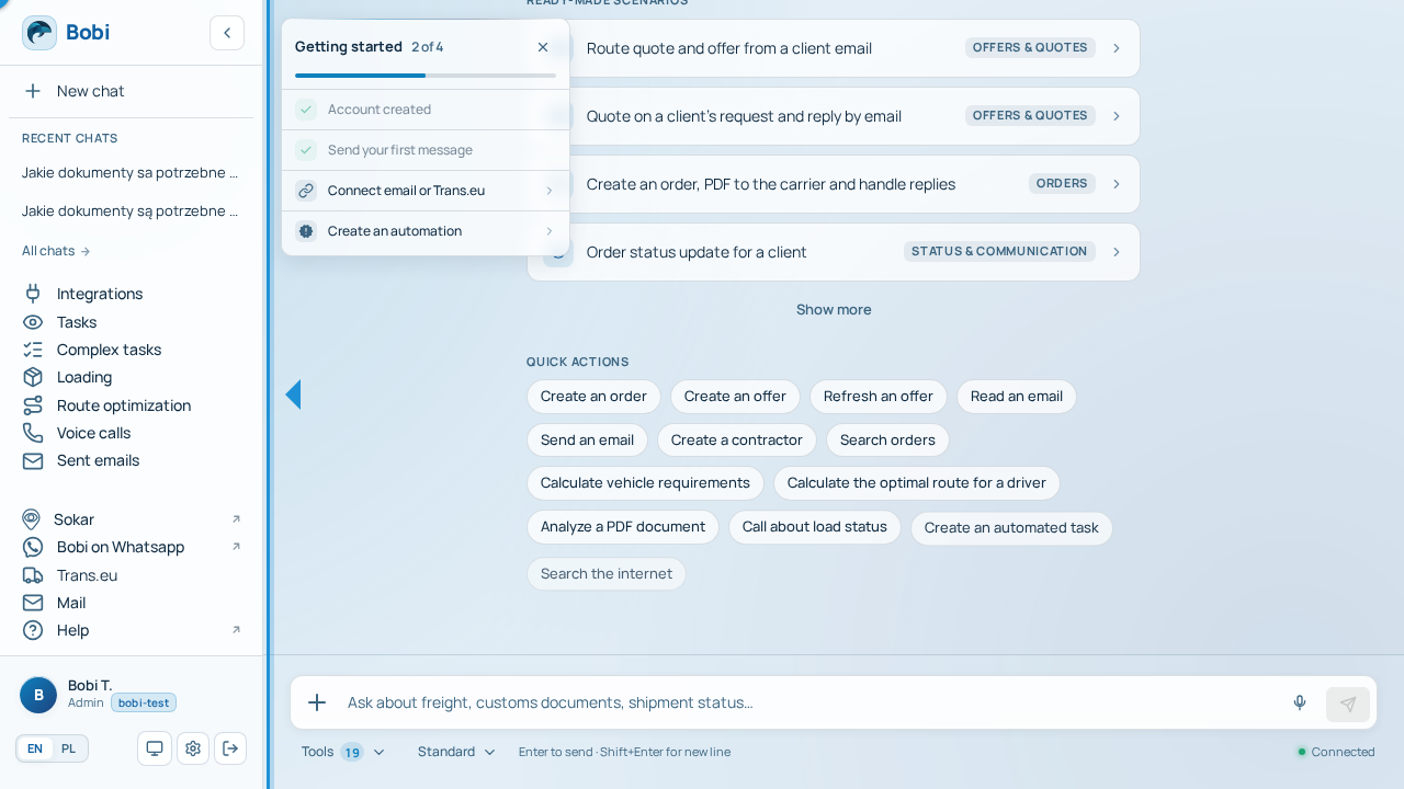
A locale-aware app screenshot. It falls back to a placeholder when no capture exists — content never blocks on missing shots.
Mermaid#
A diagram rendered on the client (a React island).
graph TD; A[Watcher] --> B[Prompt]; B --> C[Result]
AppLink#
A deep-link to an exact route in the app.
Legend of markings#
Callout colours map to message weight: information, success, warning, caution. Badges denote a feature's status.
infosuccesswarningdanger